Based on the Land Registry logo, this logo presents viewers with a different angle to look at the Registry’s logo. The “buildings” and “hill” in this logo are elongated and slightly tilted, making the logo looks vibrant and gives the impression that the Registry is full of energy.
As to the colouring, the green colour is the same as that used in the original logo of the Registry while the “buildings” and “hill” are in white colour. The design on one hand preserves the impression of the original logo and on the other highlights its originality. A logo of good design should not be colouring dependent and this design looks equally appealing even it takes on a grey hue.
Ms YAU Wing-yan(Central Imaging Centre)
Hong Kong is the Pearl of the Orient, and the Land Registry is an emerald pearl embracing in itself the essence of “securing your property”, “supporting an open market”, “making every effort”, “doing the best we can”, and “providing the best services”.
Search Services Help Desk (entered as a team)
The 15th Anniversary’s tag symbolizes that the Land Registry Trading Fund has been servicing the public for 15 years.
The “thumbs-up” sign with the Land Registry’s logo symbolize that our services are recognized by members of the public.
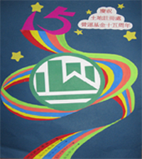
Based on the 2008 Olympics concept, this design has the five Olympic Rings reformed into a colourful ribbon to underline the 15th Anniversary of the Land Registry Trading Fund. Of the five colours of the ribbon, red represents “securing your property”; yellow represents “supporting an open market”; blue represents “making every effort”; orange represents “doing the best we can”; and green represents “providing the best services”. The five-colour ribbon will lead the Land Registry to a brighter future.
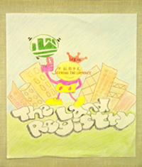
The crown with a “15th Anniversary” mark symbolizes the Land Registry Trading Fund has been servicing the public for 15 years.
The “No. 1” means the services provided by the Land Registry are always the best.
The blue sky and grassland together represent the value of the Land Registry of being environmental friendly.
The spinning Land Registry’s logo reveals the department’s belief of “striving for continuous improvement”.
The high-rise buildings as the background represent the department’s core businesses – registration and search services.
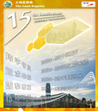
The pictures and characters in the poster are arranged in a radiating pattern to project a vibrant and 3-dimensional look. The two columns of translucent characters resemble two sets of windows aligned on two buildings. The seemingly illuminated hexagons on the upper right-hand corner symbolize security. Thus, placing buildings in the hexagons means “securing your property”.
As to the colouring, golden yellow/soil yellow symbolizes “land”, “money”, and “grandeur”, which effectively stands out a green logo of the Land Registry.
同心攜手十五年,優質服務盡展現
15 years together building service excellence
樓宇註冊很重要
查冊服務不可少
營運基金十五載
上下一心創未來
(Chinese version only)
營運基金十五年
土地註冊邁向前
市民財產得保障
竭盡所能有才賢
(Chinese version only)